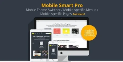
Mobile Smart Pro 1.4 – Mobile Switcher, mobile-specific content, menus
- Updated on May 5, 2026
- 100% Original Product & Well Documented
- Unlimited Domain Usage


Original price was: ₹4,500.00.₹299.00Current price is: ₹299.00.
Stop losing mobile visitors. Mobile Smart Pro 1.4 swaps content, builds device-specific menus, and tightens up every page for phones and tablets — without touching code. Instant download. Lifetime updates included.
- Secured & Scanned by Virus total & McAfee.
- Lifetime Free Updates
- GPL License (Unlimited Domain Usage)
- Pre Activated, You Don’t Need Any license Key
- 100% Satisfaction Guarantee (Refund Policy)

Lifetime Membership
Access 6700+ Premium WordPress Themes & Plugins, Elementor Templates, Mobile Apps, PHP scripts with Lifetime Updates.
Join Premium MembershipRecently Viewed
Mobile Smart Pro WordPress Plugin for Device-Targeted Content
Sixty percent of your traffic probably comes from phones and tablets. Yet most WordPress sites serve identical content to every device. That means mobile users squint at tiny text, wrestle with cramped menus, and leave. Mobile Smart Pro 1.4 fixes this. You control exactly what each device type sees.
What Mobile Smart Pro Does
The plugin detects desktops, tablets, and phones automatically — then displays the version you’ve set up for each. Swap hero images for lighter mobile versions. Show simplified navigation on phones. Hide or reveal page sections depending on device. Your visitors see a site that actually fits their screen.
- Toggle any content block by device type
- Build mobile-only navigation menus
- Swap images for device-appropriate versions
- Device detection runs silently on every page load
Why Mobile Optimization Matters for Your Business
Google ranks your site based on the mobile version. Not desktop. Mobile. If visitors hit slow load times or navigation they can’t tap, they leave — and your search rankings take a hit. Mobile Smart Pro helps you deliver experiences worth staying for.
Key Features of Mobile Smart Pro 1.4
Device detection, content switching, and mobile menus in one plugin. No juggling separate tools or hiring developers.
- Instant device detection — catches mobile, tablet, and desktop on arrival
- Custom mobile menus — built for touch and small screens
- Content visibility rules — show or hide blocks per device
- Smart image swapping — serve smaller files to phones
- Shortcode support — drop device-specific content anywhere
- Theme-compatible — works with your current WordPress setup
Who Should Use This Plugin
Bloggers chasing faster mobile load times. WooCommerce stores that need checkout flows customers can actually use on their phones. Portfolio sites where images have to look sharp everywhere. Business sites where mobile sales matter. If you run WordPress and want phone visitors to get the same quality as desktop users, this plugin delivers.
How to Get Started
Five minutes, max. Upload, activate, open settings. Create your mobile menus, set content rules, configure detection. That’s it. No code. No developer. Works with what you’ve already built.
Why Buy Mobile Smart Pro
Custom device detection and content switching runs $500–$2000+ if you hire it out. Then there’s maintenance. Mobile Smart Pro handles the same job for a fraction of that price. One payment. The plugin. Lifetime updates. Support when you need it. Your mobile visitors get a site that works for them, your conversions improve, and you never touch code.
Ready to Optimize Your Mobile Experience?
Download Mobile Smart Pro 1.4 now. Install it, spend a few minutes configuring your mobile content, and watch your mobile bounce rate drop. Instant download, commercial license, lifetime updates, one payment.
Only logged in customers who have purchased this product may leave a review.
RELATED PRODUCTS

DIVI – Original License | One Time Payment – Exclusive Deal

Elementor Pro 4.1.0 + Elementorism Landing Pages WordPress Plugin

907 5.3.6 – Responsive Multi-Purpose WordPress Theme

Element Pack Pro 9.1.0 – Addon For Elementor

Lifetime Mini Membership

 Mobile Apps
 php script
 How to
Reviews
There are no reviews yet